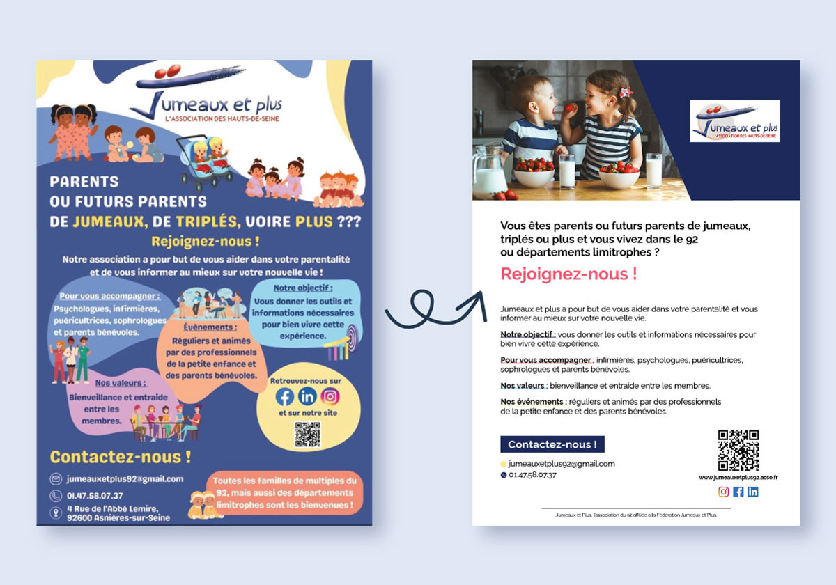
Context
Jumeaux et Plus is a French association supporting families with twins, triplets, and more.
Challenge
They wanted to refresh their communication materials, starting with a flyer that could clearly convey their mission and activities while being visually appealing and accessible to families.
solution
I worked on redesigning the flyer, focusing on:
• Simplifying the layout for better readability.
• Choosing a color palette and typography that felt welcoming and modern.
• Highlighting key messages and calls-to-action to make the flyer informative yet engaging.
• Maintaining a balance between professional design and a family-friendly, approachable feel.
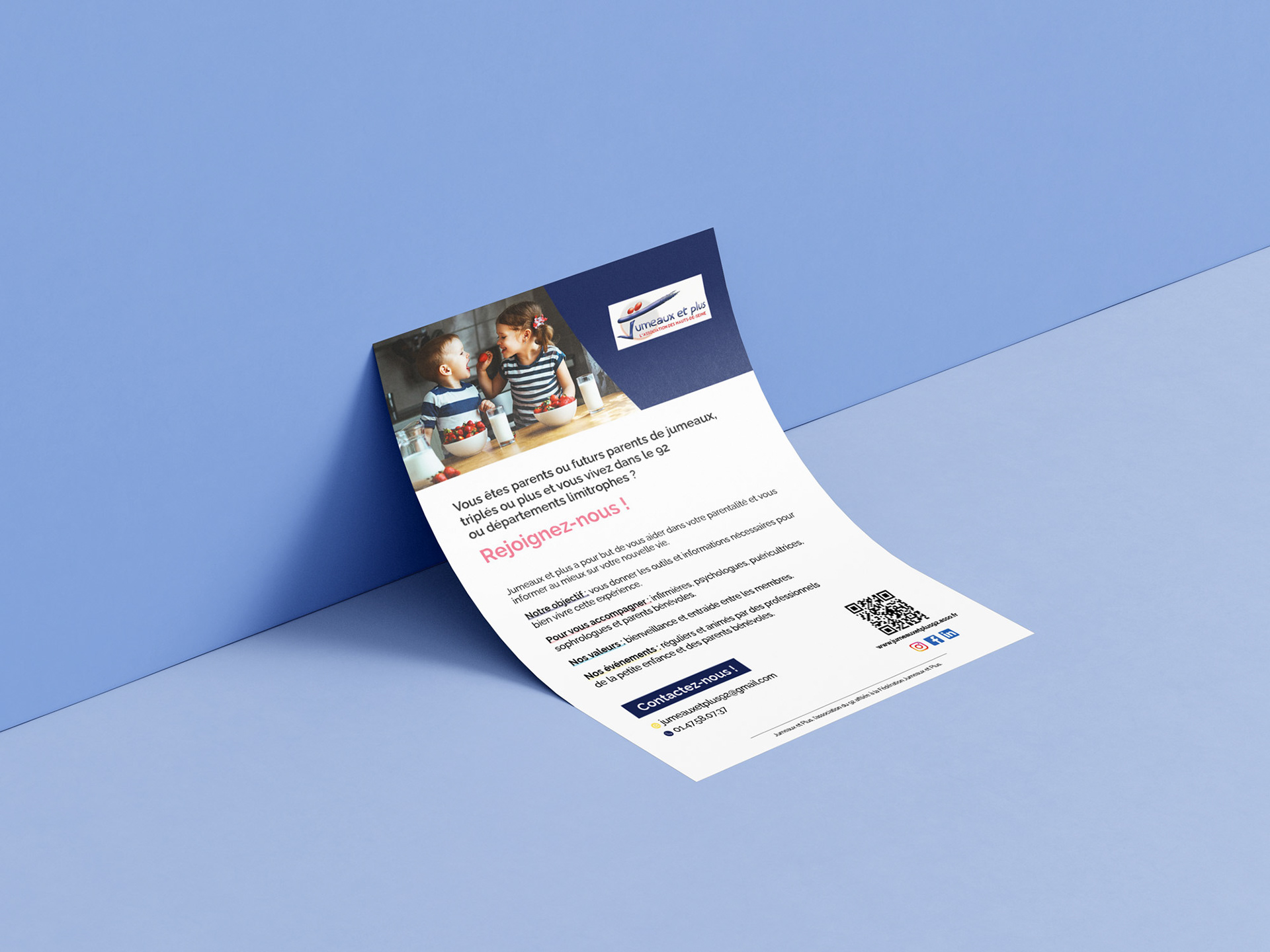
Result
The new flyer is clear, visually appealing, and approachable for families. It communicates the association’s values of support, community, and inclusivity, while ensuring that all key information is easy to find. The redesign helps Jumeaux et Plus connect more effectively with their audience and strengthens their visual identity across print materials.